tailwindcss 버튼 컴포넌트
유틸리티 기반이라 버튼 컴포넌트가 없어서 만들어 봤습니다.
빌드방법
[code]
npx tailwindcss -i src/app.css -o dist/app.css
[/code]
src/app.css
[code]
@tailwind base;
@tailwind components;
@tailwind utilities;
@layer base {
input:read-only:focus {
@apply outline-none;
}
}
@layer components {
.btn {
@apply inline-flex items-center justify-center gap-2 px-4 py-1 text-xs font-medium leading-5 text-center transition rounded border whitespace-nowrap;
&:disabled {
@apply shadow-none transform-none;
pointer-events: none;
opacity: 0.65;
}
}
.btn:hover {
&:disabled {
@apply shadow-none;
}
}
.btn-sm {
@apply px-2 py-0.5 text-xs leading-5;
}
.btn-lg {
@apply text-lg leading-8;
}
.btn-xl {
@apply text-2xl leading-10;
}
.btn-icon {}
.btn-full {
@apply flex w-full justify-center items-center;
}
.btn-primary {
@apply text-white bg-blue-500 border-transparent shadow;
&.active {
@apply bg-blue-800;
}
&:hover {
@apply shadow-lg bg-blue-600;
}
}
.btn-secondary {
@apply text-white bg-gray-500 border-transparent shadow;
&.active {
@apply bg-gray-800;
}
&:hover {
@apply shadow-lg bg-gray-600;
}
}
.btn-success {
@apply text-white bg-green-500 border-transparent shadow;
&.active {
@apply bg-green-800;
}
&:hover {
@apply shadow-lg bg-green-600;
}
}
.btn-danger {
@apply text-white bg-red-500 border-transparent shadow;
&.active {
@apply bg-red-800;
}
&:hover {
@apply shadow-lg bg-red-600;
}
}
.btn-warning {
@apply text-white bg-yellow-500 border-transparent shadow;
&.active {
@apply bg-yellow-700;
}
&:hover {
@apply shadow-lg bg-yellow-600;
}
}
.btn-info {
@apply text-white bg-indigo-300 border-transparent shadow;
&.active {
@apply bg-indigo-500;
}
&:hover {
@apply shadow-lg bg-indigo-400;
}
}
.btn-light {
@apply text-black bg-white border-transparent border-gray-300;
&.active {
@apply bg-gray-200;
}
&:hover {
@apply bg-gray-100;
}
}
.btn-dark {
@apply text-white bg-gray-700 border-transparent shadow;
&.active {
@apply bg-gray-900;
}
&:hover {
@apply shadow-lg bg-gray-800
}
}
.btn-link {
@apply text-blue-700 underline bg-white border-transparent;
&:hover {
@apply text-blue-900;
}
}
.btn-primary-o {
@apply text-blue-500 bg-white border border-blue-600 active: bg-blue-500;
&.active {
@apply bg-blue-500 text-white;
}
&:hover {
@apply bg-blue-100;
}
}
.btn-secondary-o {
@apply text-gray-500 bg-white border border-gray-500 active: bg-gray-500;
&.active {
@apply bg-gray-500 text-white;
}
&:hover {
@apply bg-gray-100;
}
}
.btn-success-o {
@apply text-green-500 bg-white border border-green-500 active: bg-green-500;
&.active {
@apply bg-green-500 text-white;
}
&:hover {
@apply bg-green-100;
}
}
.btn-danger-o {
@apply text-red-500 bg-white border border-red-500 active: bg-red-500;
&.active {
@apply bg-red-500 text-white;
}
&:hover {
@apply bg-red-100;
}
}
.btn-warning-o {
@apply text-yellow-500 bg-white border border-yellow-500 active: bg-yellow-500;
&.active {
@apply bg-yellow-500 text-white;
}
&:hover {
@apply bg-yellow-100;
}
}
.btn-info-o {
@apply text-indigo-500 bg-white border border-indigo-500 active: bg-indigo-500;
&.active {
@apply bg-indigo-500 text-white;
}
&:hover {
@apply bg-indigo-100;
}
}
.btn-dark-o {
@apply text-gray-700 bg-white border border-gray-700 active: bg-gray-700;
&.active {
@apply bg-gray-700 text-white;
}
&:hover {
@apply bg-gray-500 text-white;
}
}
}
[/code]
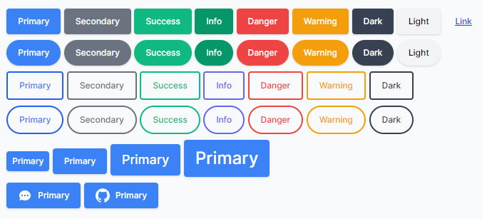
사용예제)
[code]
<div class="mb-2">
<button class="btn btn-primary">Primary</button>
<button class="btn btn-secondary">Secondary</button>
<button class="btn btn-success">Success</button>
<button class="btn btn-info">Info</button>
<button class="btn btn-danger">Danger</button>
<button class="btn btn-warning">Warning</button>
<button class="btn btn-dark">Dark</button>
<button class="btn btn-light">Light</button>
<button class="btn btn-link">Link</button>
</div>
<div class="mb-2">
<button class="rounded-full btn btn-primary">Primary</button>
<button class="rounded-full btn btn-secondary">Secondary</button>
<button class="rounded-full btn btn-success">Success</button>
<button class="rounded-full btn btn-info">Info</button>
<button class="rounded-full btn btn-danger">Danger</button>
<button class="rounded-full btn btn-warning">Warning</button>
<button class="rounded-full btn btn-dark">Dark</button>
<button class="rounded-full btn btn-light">Light</button>
</div>
<div class="mb-2">
<button class="btn btn-primary-o">Primary</button>
<button class="btn btn-secondary-o">Secondary</button>
<button class="btn btn-success-o">Success</button>
<button class="btn btn-info-o">Info</button>
<button class="btn btn-danger-o">Danger</button>
<button class="btn btn-warning-o">Warning</button>
<button class="btn btn-dark-o">Dark</button>
</div>
<div class="mb-2">
<button class="rounded-full btn btn-primary-o">Primary</button>
<button class="rounded-full btn btn-secondary-o">Secondary</button>
<button class="rounded-full btn btn-success-o">Success</button>
<button class="rounded-full btn btn-info-o">Info</button>
<button class="rounded-full btn btn-danger-o">Danger</button>
<button class="rounded-full btn btn-warning-o">Warning</button>
<button class="rounded-full btn btn-dark-o">Dark</button>
</div>
<div class="mb-2">
<button class="btn btn-sm btn-primary">Primary</button>
<button class="btn btn-primary">Primary</button>
<button class="btn btn-lg btn-primary">Primary</button>
<button class="btn btn-xl btn-primary">Primary</button>
</div>
<div class="mb-2">
<button class="btn btn-primary">
<svg class="w-5 h-5 text-white" xmlns="http://www.w3.org/2000/svg" viewBox="0 0 20 20" fill="currentColor">
<path fill-rule="evenodd"
d="M18 10c0 3.866-3.582 7-8 7a8.841 8.841 0 01-4.083-.98L2 17l1.338-3.123C2.493 12.767 2 11.434 2 10c0-3.866 3.582-7 8-7s8 3.134 8 7zM7 9H5v2h2V9zm8 0h-2v2h2V9zM9 9h2v2H9V9z"
clip-rule="evenodd"></path>
</svg>
Primary
</button>
<button class="btn btn-primary">
<svg class="w-5 h-5 text-white fill-current" xmlns="http://www.w3.org/2000/svg" viewBox="0 0 24 24">
<path
d="M12 .297c-6.63 0-12 5.373-12 12 0 5.303 3.438 9.8 8.205 11.385.6.113.82-.258.82-.577 0-.285-.01-1.04-.015-2.04-3.338.724-4.042-1.61-4.042-1.61C4.422 18.07 3.633 17.7 3.633 17.7c-1.087-.744.084-.729.084-.729 1.205.084 1.838 1.236 1.838 1.236 1.07 1.835 2.809 1.305 3.495.998.108-.776.417-1.305.76-1.605-2.665-.3-5.466-1.332-5.466-5.93 0-1.31.465-2.38 1.235-3.22-.135-.303-.54-1.523.105-3.176 0 0 1.005-.322 3.3 1.23.96-.267 1.98-.399 3-.405 1.02.006 2.04.138 3 .405 2.28-1.552 3.285-1.23 3.285-1.23.645 1.653.24 2.873.12 3.176.765.84 1.23 1.91 1.23 3.22 0 4.61-2.805 5.625-5.475 5.92.42.36.81 1.096.81 2.22 0 1.606-.015 2.896-.015 3.286 0 .315.21.69.825.57C20.565 22.092 24 17.592 24 12.297c0-6.627-5.373-12-12-12">
</path>
</svg>
Primary
</button>
</div>
[/code]
댓글 3개

게시판 목록
그누보드5 팁자료실
| 번호 | 제목 | 글쓴이 | 날짜 | 조회 |
|---|---|---|---|---|
| 공지 | 3년 전 | 4402 | ||
| 1884 | 4년 전 | 2591 | ||
| 1883 | 4년 전 | 3121 | ||
| 1882 | 4년 전 | 2994 | ||
| 1881 | 4년 전 | 3571 | ||
| 1880 |
 THIMYTIENBUI THIMYTIENBUI |
4년 전 | 2876 | |
| 1879 | 4년 전 | 3446 | ||
| 1878 | 4년 전 | 4313 | ||
| 1877 | 4년 전 | 3938 | ||
| 1876 | 4년 전 | 3894 | ||
| 1875 | 4년 전 | 3215 | ||
| 1874 | 4년 전 | 6002 | ||
| 1873 |
iiliiiliii
|
4년 전 | 4434 | |
| 1872 | 4년 전 | 5451 | ||
| 1871 | 4년 전 | 4481 | ||
| 1870 |
 Innisfree Innisfree |
4년 전 | 4707 | |
| 1869 | 4년 전 | 5465 | ||
| 1868 | 4년 전 | 4727 | ||
| 1867 |
 바트컨트롤 바트컨트롤 |
4년 전 | 3567 | |
| 1866 | 4년 전 | 7013 | ||
| 1865 | 4년 전 | 5292 | ||
| 1864 |
하나하나하나
|
4년 전 | 2634 | |
| 1863 |
Innisfree |
4년 전 | 4801 | |
| 1862 | 4년 전 | 3106 | ||
| 1861 |
 개발합니다123 개발합니다123 |
4년 전 | 3986 | |
| 1860 | 4년 전 | 3707 | ||
| 1859 | 4년 전 | 4938 | ||
| 1858 | 4년 전 | 3893 | ||
| 1857 |
바트컨트롤 |
4년 전 | 3943 | |
| 1856 | 4년 전 | 4042 | ||
| 1855 | 4년 전 | 3666 |
댓글 작성
댓글을 작성하시려면 로그인이 필요합니다.
로그인하기