
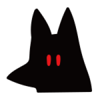
코드펜에서 이거 발견했는데...
https://codepen.io/jpanter/pen/wgbZzQ
누구... 닮은 것 같네여 ㅎㅎㅎㅎㅎ
재미난 거 많아요 코드펜에 ㅎㅎㅎ
한가할 때 이것저것 보다보면 공부도 되고 좋습니다 ~
댓글 16개
365ok
8년 전
html:
<main>
<div class="graphic-container">
<span class="face"></span>
<span class="hair"></span>
<span class="sideburns"></span>
<span class="eyebrow eyebrow-left"></span>
<span class="eyebrow eyebrow-right"></span>
<span class="nose"></span>
<span class="mouth"></span>
<span class="bubble">WRONG</span>
</div>
</main>
css:
main {
display: -webkit-box;
display: -ms-flexbox;
display: flex;
-webkit-box-pack: center;
-ms-flex-pack: center;
justify-content: center;
-webkit-box-align: center;
-ms-flex-align: center;
align-items: center;
width: 100vw;
height: 100vh;
}
.graphic-container {
position: relative;
width: 140px;
height: 140px;
}
.hair {
display: block;
position: absolute;
top: 0;
right: 0;
width: 140px;
height: 28px;
border-bottom-left-radius: 20px;
border-top-right-radius: 20px;
background: -webkit-linear-gradient(45deg, #FEC733 0%, #FEC733 30%, #FED73A 30%, #FED73A 50%, #FCE15C 50%, #FCE15C 100%);
background: linear-gradient(45deg, #FEC733 0%, #FEC733 30%, #FED73A 30%, #FED73A 50%, #FCE15C 50%, #FCE15C 100%);
-webkit-transform-origin: 100%;
transform-origin: 100%;
-webkit-animation: blow 8s infinite;
animation: blow 8s infinite;
}
.sideburns {
position: absolute;
top: 0;
right: 0;
height: 100px;
width: 20px;
background: #FCE15C;
border-bottom-left-radius: 20px;
border-top-right-radius: 20px;
}
.face {
display: block;
position: absolute;
top: 0;
right: 0;
width: 120px;
height: 130px;
background: #FBAC3E;
border-bottom-right-radius: 20px;
border-top-right-radius: 20px;
border-top-left-radius: 40px;
border-bottom-left-radius: 60px;
}
.eyebrow {
display: block;
position: absolute;
top: 40px;
background: #FCE15C;
width: 30px;
height: 6px;
-webkit-animation: bounce 4s infinite;
animation: bounce 4s infinite;
}
.eyebrow.eyebrow-left {
left: 10px;
border-bottom-left-radius: 6px;
border-top-right-radius: 6px;
}
.eyebrow.eyebrow-right {
right: 40px;
border-top-left-radius: 6px;
border-bottom-right-radius: 6px;
}
.eyebrow::after {
content: '';
position: absolute;
background: #333;
width: 12px;
height: 4px;
border-radius: 10px;
top: 10px;
left: 5px;
-webkit-animation: shift 4s infinite;
animation: shift 4s infinite;
}
.nose {
display: block;
position: absolute;
width: 8px;
height: 40px;
top: 50px;
left: 48px;
border-radius: 8px;
background: #bf6a2e;
}
.mouth {
display: block;
position: absolute;
width: 30px;
height: 6px;
top: 100px;
left: 60px;
border-radius: 6px;
background: #333;
-webkit-animation: mouth 8s infinite;
animation: mouth 8s infinite;
}
.bubble {
display: -webkit-box;
display: -ms-flexbox;
display: flex;
position: absolute;
top: 30px;
background: #FCE15C;
width: 120px;
height: 40px;
left: -140px;
border-bottom-left-radius: 12px;
border-top-right-radius: 12px;
-webkit-animation: bubble 8s infinite;
animation: bubble 8s infinite;
-webkit-box-pack: center;
-ms-flex-pack: center;
justify-content: center;
-webkit-box-align: center;
-ms-flex-align: center;
align-items: center;
font-weight: 700;
color: #333;
}
.bubble::after {
content: '';
position: absolute;
bottom: -10px;
right: -10px;
width: 10px;
height: 10px;
background: #FCE15C;
border-top-right-radius: 50%;
border-bottom-left-radius: 50%;
}
@-webkit-keyframes shift {
0% {
-webkit-transform: translateX(0);
transform: translateX(0);
}
20% {
-webkit-transform: translateX(0);
transform: translateX(0);
}
30% {
-webkit-transform: translateX(9px);
transform: translateX(9px);
}
40% {
-webkit-transform: translateX(2px);
transform: translateX(2px);
}
50% {
-webkit-transform: translateX(0);
transform: translateX(0);
}
100% {
-webkit-transform: translateX(0);
transform: translateX(0);
}
}
@keyframes shift {
0% {
-webkit-transform: translateX(0);
transform: translateX(0);
}
20% {
-webkit-transform: translateX(0);
transform: translateX(0);
}
30% {
-webkit-transform: translateX(9px);
transform: translateX(9px);
}
40% {
-webkit-transform: translateX(2px);
transform: translateX(2px);
}
50% {
-webkit-transform: translateX(0);
transform: translateX(0);
}
100% {
-webkit-transform: translateX(0);
transform: translateX(0);
}
}
@-webkit-keyframes blow {
0% {
-webkit-transform: rotate(0);
transform: rotate(0);
}
30% {
-webkit-transform: rotate(2deg);
transform: rotate(2deg);
}
50% {
-webkit-transform: rotate(0);
transform: rotate(0);
}
80% {
-webkit-transform: rotat
게시판 목록
자유게시판
| 번호 | 제목 | 글쓴이 | 날짜 | 조회 |
|---|---|---|---|---|
| 공지 |
 thisgun thisgun |
2주 전 | 50 | |
| 199718 |
thisgun |
2주 전 | 31 | |
| 199717 | 1개월 전 | 29 | ||
| 199716 |
느긋한카키쿠키
|
1개월 전 | 19 | |
| 199715 |
현대적인무질서한까마귀
|
1개월 전 | 22 | |
| 199714 | 1개월 전 | 33 | ||
| 199713 | 1개월 전 | 41 | ||
| 199712 | 1개월 전 | 302 | ||
| 199711 |
안졸리니졸리니
|
1개월 전 | 148 | |
| 199710 |
 glitter0gim glitter0gim |
1개월 전 | 163 | |
| 199709 |
glitter0gim |
1개월 전 | 96 | |
| 199708 | 1개월 전 | 110 | ||
| 199707 | 1개월 전 | 245 | ||
| 199706 | 1개월 전 | 46 | ||
| 199705 | 1개월 전 | 30 | ||
| 199704 | 1개월 전 | 55 | ||
| 199703 | 2개월 전 | 59 | ||
| 199702 | 2개월 전 | 103 | ||
| 199701 | 2개월 전 | 113 | ||
| 199700 | 2개월 전 | 85 | ||
| 199699 | 2개월 전 | 91 | ||
| 199698 | 2개월 전 | 139 | ||
| 199697 | 2개월 전 | 102 | ||
| 199696 |
 Gothrock Gothrock |
2개월 전 | 251 | |
| 199695 | 2개월 전 | 95 | ||
| 199694 | 2개월 전 | 124 | ||
| 199693 | 2개월 전 | 190 | ||
| 199692 | 2개월 전 | 205 | ||
| 199691 |
 샬롬이아빠 샬롬이아빠 |
2개월 전 | 178 | |
| 199690 | 2개월 전 | 265 | ||
| 199689 | 2개월 전 | 164 |
댓글 작성
댓글을 작성하시려면 로그인이 필요합니다.
로그인하기