반응 형 테이블
이 .table-responsive클래스는 반응 형 테이블을 생성합니다. 그러면 테이블이 작은 장치 (768px 미만)에서 가로로 스크롤됩니다. 768px 너비보다 큰 것을 볼 때 차이점은 없습니다.
예
<div class="table-responsive">
<table class="table">
...
</table>
</div>
<!DOCTYPE html>
<html>
<head>
<meta name="viewport" content="width=device-width, initial-scale=1">
<link rel="stylesheet" href="https://maxcdn.bootstrapcdn.com/bootstrap/3.3.7/css/bootstrap.min.css">
<script src="https://ajax.googleapis.com/ajax/libs/jquery/3.2.1/jquery.min.js"></script>
<script src="https://maxcdn.bootstrapcdn.com/bootstrap/3.3.7/js/bootstrap.min.js"></script>
</head>
<body>
<div class="container">
<h2>Table</h2>
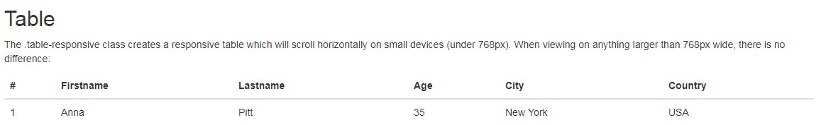
<p>The .table-responsive class creates a responsive table which will scroll horizontally on small devices (under 768px). When viewing on anything larger than 768px wide, there is no difference:</p>
<div class="table-responsive">
<table class="table">
<thead>
<tr>
<th>#</th>
<th>Firstname</th>
<th>Lastname</th>
<th>Age</th>
<th>City</th>
<th>Country</th>
</tr>
</thead>
<tbody>
<tr>
<td>1</td>
<td>Anna</td>
<td>Pitt</td>
<td>35</td>
<td>New York</td>
<td>USA</td>
</tr>
</tbody>
</table>
</div>
</div>
</body>
</html>
이 .table-responsive클래스는 반응 형 테이블을 생성합니다. 그러면 테이블이 작은 장치 (768px 미만)에서 가로로 스크롤됩니다. 768px 너비보다 큰 것을 볼 때 차이점은 없습니다.
예
<div class="table-responsive">
<table class="table">
...
</table>
</div>
<!DOCTYPE html>
<html>
<head>
<meta name="viewport" content="width=device-width, initial-scale=1">
<link rel="stylesheet" href="https://maxcdn.bootstrapcdn.com/bootstrap/3.3.7/css/bootstrap.min.css">
<script src="https://ajax.googleapis.com/ajax/libs/jquery/3.2.1/jquery.min.js"></script>
<script src="https://maxcdn.bootstrapcdn.com/bootstrap/3.3.7/js/bootstrap.min.js"></script>
</head>
<body>
<div class="container">
<h2>Table</h2>
<p>The .table-responsive class creates a responsive table which will scroll horizontally on small devices (under 768px). When viewing on anything larger than 768px wide, there is no difference:</p>
<div class="table-responsive">
<table class="table">
<thead>
<tr>
<th>#</th>
<th>Firstname</th>
<th>Lastname</th>
<th>Age</th>
<th>City</th>
<th>Country</th>
</tr>
</thead>
<tbody>
<tr>
<td>1</td>
<td>Anna</td>
<td>Pitt</td>
<td>35</td>
<td>New York</td>
<td>USA</td>
</tr>
</tbody>
</table>
</div>
</div>
</body>
</html>
첨부파일
댓글 작성
댓글을 작성하시려면 로그인이 필요합니다.
로그인하기