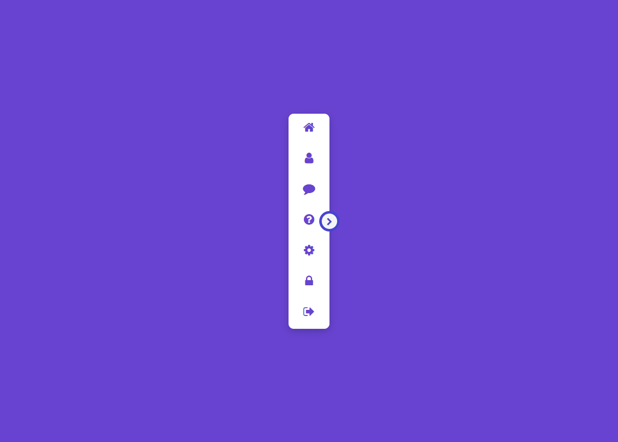
간단하게 메뉴꾸미기 1

menu01.html
<!DOCTYPE html>
<html lang="en">
<head>
<meta charset="UTF-8">
<meta http-equiv="X-UA-Compatible" content="IE=edge">
<meta name="viewport" content="width=device-width, initial-scale=1.0">
<title>Responsive Navigation Drawer using HTML CSS & Javascript | Drawer Menu</title>
<link rel="stylesheet" href="https://stackpath.bootstrapcdn.com/font-awesome/4.7.0/css/font-awesome.min.css" integrity="sha384-wvfXpqpZZVQGK6TAh5PVlGOfQNHSoD2xbE+QkPxCAFlNEevoEH3Sl0sibVcOQVnN" crossorigin="anonymous">
<link rel="stylesheet" href="css/menu01.css">
</head>
<body>
<div class="container">
<div class="navigation">
<ul>
<li>
<a href="#">
<span class="icon"><i class="fa fa-home" aria-hidden="true"></i></span>
<span class="title">Home</span>
</a>
</li>
<li>
<a href="#">
<span class="icon"><i class="fa fa-user" aria-hidden="true"></i></span>
<span class="title">Profile</span>
</a>
</li>
<li>
<a href="#">
<span class="icon"><i class="fa fa-comment" aria-hidden="true"></i></span>
<span class="title">Message</span>
</a>
</li>
<li>
<a href="#">
<span class="icon"><i class="fa fa-question-circle" aria-hidden="true"></i></span>
<span class="title">Help</span>
</a>
</li>
<li>
<a href="#">
<span class="icon"><i class="fa fa-cog" aria-hidden="true"></i></span>
<span class="title">Setting</span>
</a>
</li>
<li>
<a href="#">
<span class="icon"><i class="fa fa-lock" aria-hidden="true"></i></span>
<span class="title">Password</span>
</a>
</li>
<li>
<a href="#">
<span class="icon"><i class="fa fa-sign-out" aria-hidden="true"></i></span>
<span class="title">sign Out</span>
</a>
</li>
</ul>
</div>
<div class="toggle"></div>
</div>
<script>
const navigation = document.querySelector('.navigation');
document.querySelector('.toggle').onclick = function(){
this.classList.toggle('active');
navigation.classList.toggle('active');
}
</script>
</body>
</html>
menu01.css
@import url('https://fonts.googleapis.com/css2?family=Poppins:wght@100;200;300;400;500;600;700;800;900&display=swap');
*{ margin: 0; padding: 0; box-sizing: border-box; font-family: 'Poppins', sans-serif; }
body{ display: flex; justify-content: center; align-items: center; min-height: 100vh; background: #6843d1; }
.container { position: relative; }
.container .navigation { position:relative; width: 80px; height: 420px; background: #fff; border-radius: 10px; overflow: hidden; box-shadow: 0 5px 15px rgba(0,0,0,0.2); transition: 0.5s; }
.container .navigation.active { width: 300px }
.container .navigation ul { position: absolute; top: 0; left: 0; width: 100%; }
.container .navigation ul li { position: relative; list-style: none; width: 100%; }
.container .navigation ul li:hover { background: #efefef; }
.container .navigation ul li a { position: relative; display: block; width: 100%; display: flex; text-decoration: none; color: #6843cf; font-weight: 500; }
.container .navigation ul li a .icon { position: relative; display: block; min-width: 80px; height: 60px; line-height: 60px; text-align: center; }
.container .navigation ul li a .icon .fa { font-size: 24px; }
.container .navigation ul li a .title { position: relative; display: block; height: 60px; line-height: 60px; white-space: nowrap; }
.toggle { position: absolute; top: calc(50% - 20px); right: -20px; width: 40px; height: 40px; background: #f5f5f5; cursor: pointer; border: 5px solid #4843d1; border-radius: 50%; }
.toggle::before { content: '\f054'; font-family: fontAwesome; position: absolute; width:100%; height: 100%; line-height: 32px; text-align: center; font-size: 16px; color: #4843d1 }
.toggle.active::before { content: '\f053'; }
ps :
<link rel="stylesheet" href="https://stackpath.bootstrapcdn.com/font-awesome/4.7.0/css/font-awesome.min.css" integrity="sha384-wvfXpqpZZVQGK6TAh5PVlGOfQNHSoD2xbE+QkPxCAFlNEevoEH3Sl0sibVcOQVnN" crossorigin="anonymous">
댓글 16개
arari
4년 전
수고하셨습니다. 스크랩 한 후 bootstrap5 beta3 용 그누보드메뉴 작성할 때 참고하겠습니다.
4년 전
@arari 감사합니다.

4년 전
한글로 좀 ; */그려주세요/*
DawnDew
4년 전
오..좋습니다
4년 전
@DawnDew 감사합니다.
4년 전
감사합니다
4년 전
@마음으로 감사합니다.
sinbi
3년 전
이쁘네요. 좋은 스킨 감사합니다.
https://codepen.io/sinbi/pen/MWXYaJK
https://codepen.io/sinbi/pen/MWXYaJK
3년 전
@sinbi 와우 최고~~ㅎㅎㅎ
2년 전
@하늘뚱 감사합니다.
2년 전
감사합니다.
2년 전
좋네요. ^^
2년 전
@오소피아 감사합니다.
2년 전
@오소피아 감사합니다.

우아한마녀블랑
2년 전
오 이거 너무 좋네요 추가해봐야지!
2년 전
@우아한마녀블랑 감사합니다.
게시판 목록
퍼블리싱강좌
| 번호 | 분류 | 제목 | 글쓴이 | 날짜 | 조회 |
|---|---|---|---|---|---|
| 28 | 반응형웹 | 9년 전 | 4489 | ||
| 27 | 반응형웹 | 9년 전 | 7558 | ||
| 26 | 부트스트랩 |
 돼지코구뇽 돼지코구뇽 |
10년 전 | 14831 | |
| 25 | 부트스트랩 |
돼지코구뇽 |
10년 전 | 9424 | |
| 24 | 표준화 | 11년 전 | 8296 | ||
| 23 | 반응형웹 | 12년 전 | 13493 | ||
| 22 | 표준화 | 12년 전 | 9466 | ||
| 21 | 표준화 | 12년 전 | 16753 | ||
| 20 | 반응형웹 | 13년 전 | 19690 | ||
| 19 | 반응형웹 | 13년 전 | 31007 | ||
| 18 | 반응형웹 | 13년 전 | 36485 | ||
| 17 | 표준화 | 13년 전 | 12909 | ||
| 16 | 반응형웹 | 13년 전 | 29305 | ||
| 15 | 반응형웹 | 13년 전 | 11839 | ||
| 14 | 반응형웹 | 13년 전 | 31752 | ||
| 13 | 반응형웹 | 13년 전 | 29734 | ||
| 12 | 반응형웹 | 13년 전 | 39242 | ||
| 11 | 반응형웹 | 13년 전 | 50635 | ||
| 10 | 반응형웹 | 13년 전 | 32781 | ||
| 9 | 표준화 | 13년 전 | 9156 | ||
| 8 | 표준화 | 13년 전 | 11230 | ||
| 7 | 표준화 | 13년 전 | 9168 | ||
| 6 | 표준화 | 13년 전 | 11135 | ||
| 5 | 표준화 | 13년 전 | 11238 | ||
| 4 | 표준화 | 13년 전 | 14713 | ||
| 3 | 표준화 | 13년 전 | 8063 | ||
| 2 | 표준화 | 13년 전 | 10173 | ||
| 1 | 표준화 | 13년 전 | 11903 |
댓글 작성
댓글을 작성하시려면 로그인이 필요합니다.
로그인하기