
menu02.html
<!DOCTYPE html>
<html lang="en">
<head>
<meta charset="UTF-8">
<meta http-equiv="X-UA-Compatible" content="IE=edge">
<meta name="viewport" content="width=device-width, initial-scale=1.0">
<title>Animated Menu Indicator using CSS & Javascript | CSS Hover indicator</title>
<link rel="stylesheet" href="https://stackpath.bootstrapcdn.com/font-awesome/4.7.0/css/font-awesome.min.css" integrity="sha384-wvfXpqpZZVQGK6TAh5PVlGOfQNHSoD2xbE+QkPxCAFlNEevoEH3Sl0sibVcOQVnN" crossorigin="anonymous">
<link rel="stylesheet" href="css/menu02.css">
</head>
<body>
<div class="container">
<div class="navigation">
<ul>
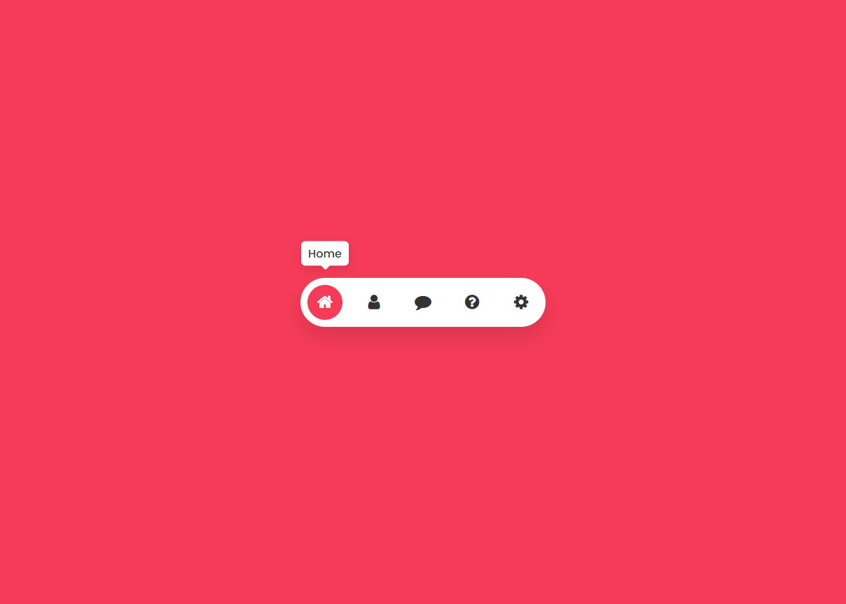
<li class="list active" data-color="#f53b57">
<a href="#">
<span class="icon"><i class="fa fa-home" aria-hidden="true"></i></span>
<span class="title">Home</span>
</a>
</li>
<li class="list" data-color="#3c40c6">
<a href="#">
<span class="icon"><i class="fa fa-user" aria-hidden="true"></i></span>
<span class="title">Profile</span>
</a>
</li>
<li class="list" data-color="#05c46b">
<a href="#">
<span class="icon"><i class="fa fa-comment" aria-hidden="true"></i></span>
<span class="title">Message</span>
</a>
</li>
<li class="list" data-color="#0fbcf9">
<a href="#">
<span class="icon"><i class="fa fa-question-circle" aria-hidden="true"></i></span>
<span class="title">Help</span>
</a>
</li>
<li class="list" data-color="#ffa831">
<a href="#">
<span class="icon"><i class="fa fa-cog" aria-hidden="true"></i></span>
<span class="title">Setting</span>
</a>
</li>
<div class="indicator"></div>
</ul>
</div>
</div>
<script>
let list = document.querySelectorAll('.list');
for (let i=0; i<list.length; i++){
list[i].onmouseover = function(){
let j = 0;
while (j < list.length){
list[j++].className = 'list';
}
list[i].className = 'list active';
}
}
list.forEach(elements => {
elements.addEventListener("mouseenter", function(event){
let bg = document.querySelector('body');
let color = event.target.getAttribute('data-color');
bg.style.backgroundColor = color;
})
})
</script>
</body>
</html>
menu02.css
@import url('https://fonts.googleapis.com/css2?family=Poppins:wght@100;200;300;400;500;600;700;800;900&display=swap');
*{
margin: 0;
padding: 0;
box-sizing: border-box;
font-family: 'Poppins', sans-serif;
}
body {
display: flex;
/* 메뉴를 수평 가운데 */
justify-content: center;
/* 메뉴를 수직 가운데 */
align-items: center;
min-height: 100vh;
transition: 0.5s;
background: #f53b57;
/* padding: 5% 0; */
}
.container{
/*메뉴바 전체를 회전*/
/* transform: rotate(90deg); */
}
.navigation {
position: relative;
width: 350px;
height: 70px;
background: #fff;
border-radius: 35px;
box-shadow: 0 15px 25px rgba(0,0,0,0.1);
}
.navigation ul {
position: absolute;
top: 0;
left: 0;
width: 100%;
display: flex;
}
.navigation ul li {
position: relative;
list-style: none;
width: 70px;
height: 70px;
z-index: 2;
}
.navigation ul li a {
position: relative;
display: flex;
justify-content: center;
align-items: center;
width: 100%;
text-align: center;
color: #333;
font-weight: 500;
}
.navigation ul li a .icon {
position: relative;
display: block;
line-height: 75px;
text-align: center;
transition: 0.5s;
/* 메뉴 아이콘 회전 */
/* transform: rotate(-90deg); */
}
/* .navigation ul li.active a .icon, */
.navigation ul li.active a .icon {
color: #fff;
/* 메뉴 아이콘 회전 */
/* transform: rotate(-90deg); */
}
.navigation ul li a .icon .fa { font-size: 24px; }
.navigation ul li a .title {
position: absolute;
top: -70px;
left: 50%;
transform: translate(-50%, 15%);
background: #fff;
width: auto;
padding: 5px 10px;
border-radius: 6px;
box-shadow: 0 5px 15px rgba(0,0,0,0.1);
transition: 0.5s;
opacity: 0;
visibility: hidden;
}
.navigation ul li.active a .title {
opacity: 1;
visibility: visible;
transform: translate(-50%, 50%);
}
.navigation ul li a .title::before {
content: '';
position:absolute;
width: 12px;
height: 12px;
background: #fff;
bottom: -8px;
left: 48%;
transform: rotate(45deg) translateX(-50%);
border-radius: 2px;
}
.navigation ul .indicator {
position: absolute;
left: 0;
width: 70px;
height: 70px;
/* background: #ff0; */
transition: 0.5s;
}
.navigation ul .indicator:before {
content: '';
position: absolute;
top: 50%;
left: 50%;
transform: translate(-50%, -50%);
background: #333;
width: 50px;
height: 50px;
border-radius: 50%;
transition: 0.5s;
}
.navigation ul li:nth-child(1).active ~ .indicator {
transform: translateX(calc(70px * 0));
}
.navigation ul li:nth-child(2).active ~ .indicator {
transform: translateX(calc(70px * 1));
}
.navigation ul li:nth-child(3).active ~ .indicator {
transform: translateX(calc(70px * 2));
}
.navigation ul li:nth-child(4).active ~ .indicator {
transform: translateX(calc(70px * 3));
}
.navigation ul li:nth-child(5).active ~ .indicator {
transform: translateX(calc(70px * 4));
}
.navigation ul li:nth-child(1).active ~ .indicator::before {
background: #f53b57;
}
.navigation ul li:nth-child(2).active ~ .indicator::before {
background: #3c40c6;
}
.navigation ul li:nth-child(3).active ~ .indicator::before {
background: #05c46b;
}
.navigation ul li:nth-child(4).active ~ .indicator::before {
background: #0fbcf9;
}
.navigation ul li:nth-child(5).active ~ .indicator::before {
background: #ffa831;
}
<!DOCTYPE html>
<html lang="en">
<head>
<meta charset="UTF-8">
<meta http-equiv="X-UA-Compatible" content="IE=edge">
<meta name="viewport" content="width=device-width, initial-scale=1.0">
<title>Animated Menu Indicator using CSS & Javascript | CSS Hover indicator</title>
<link rel="stylesheet" href="https://stackpath.bootstrapcdn.com/font-awesome/4.7.0/css/font-awesome.min.css" integrity="sha384-wvfXpqpZZVQGK6TAh5PVlGOfQNHSoD2xbE+QkPxCAFlNEevoEH3Sl0sibVcOQVnN" crossorigin="anonymous">
<link rel="stylesheet" href="css/menu02.css">
</head>
<body>
<div class="container">
<div class="navigation">
<ul>
<li class="list active" data-color="#f53b57">
<a href="#">
<span class="icon"><i class="fa fa-home" aria-hidden="true"></i></span>
<span class="title">Home</span>
</a>
</li>
<li class="list" data-color="#3c40c6">
<a href="#">
<span class="icon"><i class="fa fa-user" aria-hidden="true"></i></span>
<span class="title">Profile</span>
</a>
</li>
<li class="list" data-color="#05c46b">
<a href="#">
<span class="icon"><i class="fa fa-comment" aria-hidden="true"></i></span>
<span class="title">Message</span>
</a>
</li>
<li class="list" data-color="#0fbcf9">
<a href="#">
<span class="icon"><i class="fa fa-question-circle" aria-hidden="true"></i></span>
<span class="title">Help</span>
</a>
</li>
<li class="list" data-color="#ffa831">
<a href="#">
<span class="icon"><i class="fa fa-cog" aria-hidden="true"></i></span>
<span class="title">Setting</span>
</a>
</li>
<div class="indicator"></div>
</ul>
</div>
</div>
<script>
let list = document.querySelectorAll('.list');
for (let i=0; i<list.length; i++){
list[i].onmouseover = function(){
let j = 0;
while (j < list.length){
list[j++].className = 'list';
}
list[i].className = 'list active';
}
}
list.forEach(elements => {
elements.addEventListener("mouseenter", function(event){
let bg = document.querySelector('body');
let color = event.target.getAttribute('data-color');
bg.style.backgroundColor = color;
})
})
</script>
</body>
</html>
menu02.css
@import url('https://fonts.googleapis.com/css2?family=Poppins:wght@100;200;300;400;500;600;700;800;900&display=swap');
*{
margin: 0;
padding: 0;
box-sizing: border-box;
font-family: 'Poppins', sans-serif;
}
body {
display: flex;
/* 메뉴를 수평 가운데 */
justify-content: center;
/* 메뉴를 수직 가운데 */
align-items: center;
min-height: 100vh;
transition: 0.5s;
background: #f53b57;
/* padding: 5% 0; */
}
.container{
/*메뉴바 전체를 회전*/
/* transform: rotate(90deg); */
}
.navigation {
position: relative;
width: 350px;
height: 70px;
background: #fff;
border-radius: 35px;
box-shadow: 0 15px 25px rgba(0,0,0,0.1);
}
.navigation ul {
position: absolute;
top: 0;
left: 0;
width: 100%;
display: flex;
}
.navigation ul li {
position: relative;
list-style: none;
width: 70px;
height: 70px;
z-index: 2;
}
.navigation ul li a {
position: relative;
display: flex;
justify-content: center;
align-items: center;
width: 100%;
text-align: center;
color: #333;
font-weight: 500;
}
.navigation ul li a .icon {
position: relative;
display: block;
line-height: 75px;
text-align: center;
transition: 0.5s;
/* 메뉴 아이콘 회전 */
/* transform: rotate(-90deg); */
}
/* .navigation ul li.active a .icon, */
.navigation ul li.active a .icon {
color: #fff;
/* 메뉴 아이콘 회전 */
/* transform: rotate(-90deg); */
}
.navigation ul li a .icon .fa { font-size: 24px; }
.navigation ul li a .title {
position: absolute;
top: -70px;
left: 50%;
transform: translate(-50%, 15%);
background: #fff;
width: auto;
padding: 5px 10px;
border-radius: 6px;
box-shadow: 0 5px 15px rgba(0,0,0,0.1);
transition: 0.5s;
opacity: 0;
visibility: hidden;
}
.navigation ul li.active a .title {
opacity: 1;
visibility: visible;
transform: translate(-50%, 50%);
}
.navigation ul li a .title::before {
content: '';
position:absolute;
width: 12px;
height: 12px;
background: #fff;
bottom: -8px;
left: 48%;
transform: rotate(45deg) translateX(-50%);
border-radius: 2px;
}
.navigation ul .indicator {
position: absolute;
left: 0;
width: 70px;
height: 70px;
/* background: #ff0; */
transition: 0.5s;
}
.navigation ul .indicator:before {
content: '';
position: absolute;
top: 50%;
left: 50%;
transform: translate(-50%, -50%);
background: #333;
width: 50px;
height: 50px;
border-radius: 50%;
transition: 0.5s;
}
.navigation ul li:nth-child(1).active ~ .indicator {
transform: translateX(calc(70px * 0));
}
.navigation ul li:nth-child(2).active ~ .indicator {
transform: translateX(calc(70px * 1));
}
.navigation ul li:nth-child(3).active ~ .indicator {
transform: translateX(calc(70px * 2));
}
.navigation ul li:nth-child(4).active ~ .indicator {
transform: translateX(calc(70px * 3));
}
.navigation ul li:nth-child(5).active ~ .indicator {
transform: translateX(calc(70px * 4));
}
.navigation ul li:nth-child(1).active ~ .indicator::before {
background: #f53b57;
}
.navigation ul li:nth-child(2).active ~ .indicator::before {
background: #3c40c6;
}
.navigation ul li:nth-child(3).active ~ .indicator::before {
background: #05c46b;
}
.navigation ul li:nth-child(4).active ~ .indicator::before {
background: #0fbcf9;
}
.navigation ul li:nth-child(5).active ~ .indicator::before {
background: #ffa831;
}

댓글 작성
댓글을 작성하시려면 로그인이 필요합니다.
로그인하기